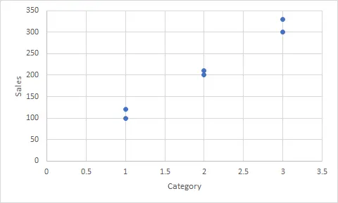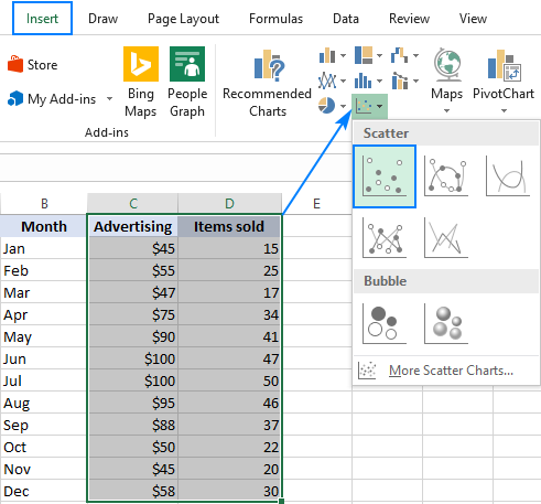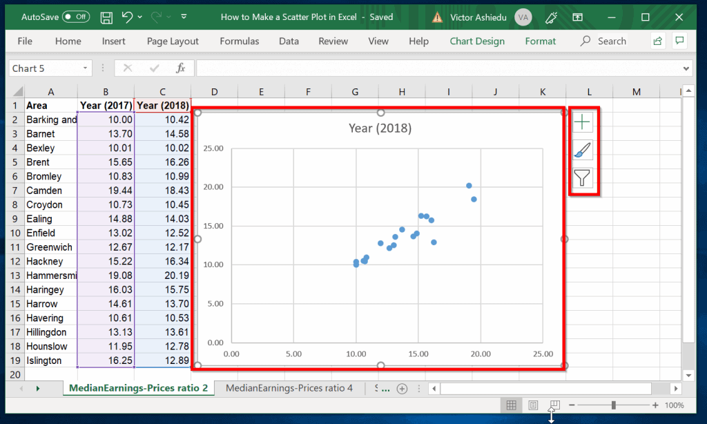
Scatter charts are a popular way to visualize relationships between two variables in Excel. However, interpreting the data can be challenging without labels to identify specific data points. Adding labels to an Excel scatter chart can make it more informative and easier to understand. In this article, we will explore five ways to add labels to Excel scatter charts.
Adding labels to a scatter chart can be useful in various scenarios. For instance, if you're analyzing the relationship between sales and profits, you may want to highlight specific data points that correspond to particular products or regions. By adding labels, you can make your chart more engaging and facilitate better decision-making.
In the following sections, we will discuss five methods to add labels to Excel scatter charts, including using data labels, text boxes, and VBA macros.
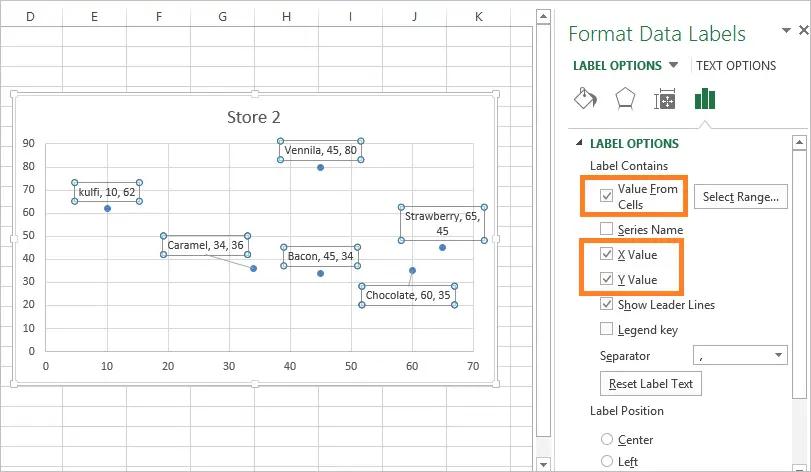
Method 1: Using Data Labels

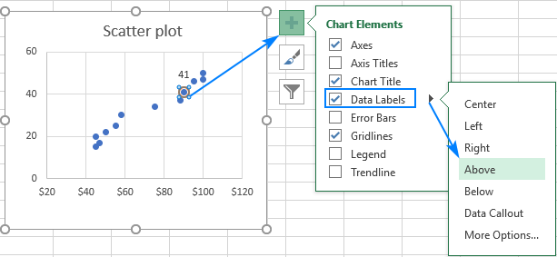
One of the simplest ways to add labels to a scatter chart is by using data labels. To do this:
- Select the data series in your scatter chart.
- Go to the "Chart Tools" tab in the ribbon.
- Click on the "Add Chart Element" button.
- Select "Data Labels" from the drop-down menu.
- Choose the label type you want to use, such as "Value" or "Series Name."
By default, Excel will display the value of each data point as a label. You can customize the label format and position by using the "Data Label Options" button.
Customizing Data Label Format
To change the label format, follow these steps:
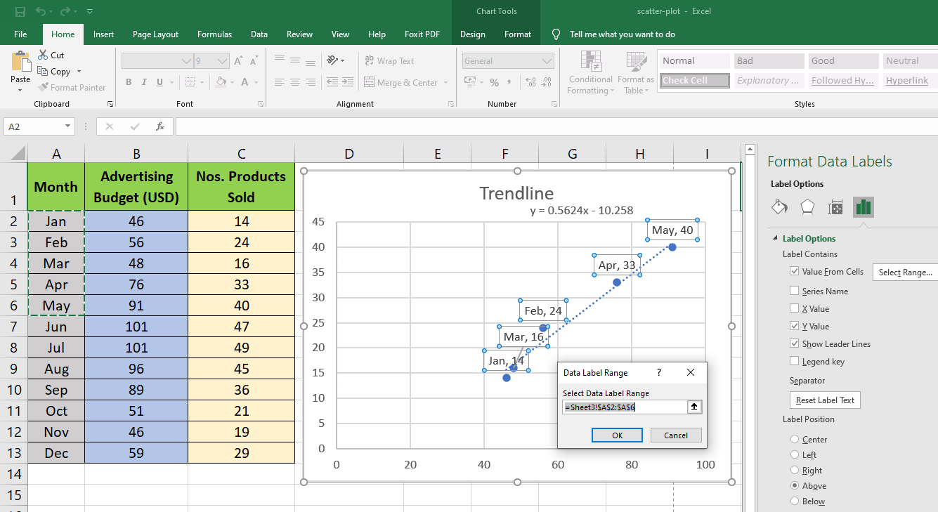
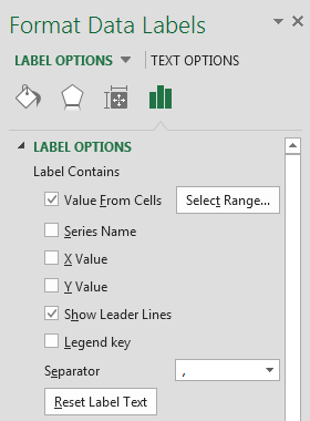
- Select the data labels in your chart.
- Right-click on the labels and select "Format Data Labels."
- In the "Format Data Labels" pane, select the "Number" category.
- Choose a format from the list, such as "Currency" or "Percentage."
- Click "OK" to apply the changes.
You can also adjust the label position by using the "Label Position" dropdown menu.
Method 2: Using Text Boxes

Another way to add labels to a scatter chart is by using text boxes. This method provides more flexibility in terms of label placement and formatting. To use text boxes:
- Select the chart area.
- Go to the "Insert" tab in the ribbon.
- Click on the "Text Box" button.
- Draw a text box near the data point you want to label.
- Type the label text inside the text box.
You can format the text box by using the "Format" tab in the ribbon. You can change the font, color, and alignment to match your chart's design.
Linking Text Boxes to Data
To link a text box to a data point, follow these steps:
- Select the text box.
- Go to the "Formula Bar" and type "=A1", where A1 is the cell containing the data value.
- Press "Enter" to apply the formula.
The text box will now display the value of the linked cell.
Method 3: Using the " Labels" Feature in Excel 2013 and Later

In Excel 2013 and later versions, you can use the built-in "Labels" feature to add labels to a scatter chart. To use this feature:
- Select the data series in your scatter chart.
- Go to the "Chart Tools" tab in the ribbon.
- Click on the "Add Chart Element" button.
- Select "Labels" from the drop-down menu.
- Choose the label type you want to use, such as "Value" or "Series Name."
The "Labels" feature allows you to add labels to individual data points or to the entire data series.
Method 4: Using VBA Macros

If you're comfortable with VBA programming, you can create a macro to add labels to a scatter chart. To create a macro:
- Press "Alt + F11" to open the Visual Basic Editor.
- In the Editor, insert a new module by clicking "Insert" > "Module."
- Paste the following code into the module:
Sub AddLabelsToScatterChart()
    Dim cht As Chart
    Dim ser As Series
    Dim i As Long

    Set cht = ActiveSheet.ChartObjects(1).Chart
    Set ser = cht.SeriesCollection(1)

    For i = 1 To ser.Points.Count
        ser.Points(i).DataLabel.Text = ser.Values(i)
    Next i
End Sub
- Save the module by clicking "File" > "Save."
- Run the macro by clicking "Developer" > "Macros" > "Run."
This macro will add labels to the scatter chart based on the values in the data series.
Method 5: Using Third-Party Add-ins

There are several third-party add-ins available that can help you add labels to a scatter chart. Some popular add-ins include:
- ASAP Utilities
- Power BI
- Excel-Tool
These add-ins provide additional features and functionality to help you create more informative and engaging scatter charts.
Gallery of Scatter Chart Labels


We hope this article has helped you learn how to add labels to an Excel scatter chart. Whether you use data labels, text boxes, or VBA macros, adding labels can make your chart more informative and engaging.
If you have any questions or need further assistance, please leave a comment below. Don't forget to share this article with your friends and colleagues who may find it useful.
How do I add labels to a scatter chart in Excel?
+You can add labels to a scatter chart in Excel using data labels, text boxes, or VBA macros. Follow the steps outlined in this article to learn more.
