Excel is an incredibly powerful tool for data analysis, and one of its most useful features is the ability to create stacked column charts. These charts allow you to compare multiple data series across different categories, making it easier to visualize and understand complex data sets. In this article, we will explore how to create stacked column charts in Excel with ease.
The Importance of Data Visualization
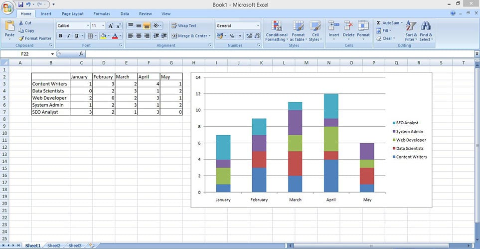
Data visualization is a crucial aspect of data analysis. By presenting data in a graphical format, you can quickly and easily communicate complex information to others. Stacked column charts are particularly useful when you want to show how different components contribute to a whole. For example, you might use a stacked column chart to show how different departments contribute to a company's overall revenue.
Benefits of Using Stacked Column Charts
Stacked column charts offer several benefits, including:
- Easy comparison of data series: By stacking multiple data series on top of each other, you can easily compare the relative sizes of each series.
- Clear visualization of contributions: Stacked column charts make it easy to see how different components contribute to a whole.
- Simplified data analysis: By visualizing data in a stacked column chart, you can quickly identify trends and patterns that might be difficult to see in a table or other format.
Creating a Stacked Column Chart in Excel
Creating a stacked column chart in Excel is a straightforward process. Here's a step-by-step guide:

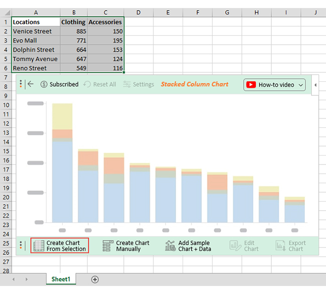
Step 1: Select Your Data
The first step in creating a stacked column chart is to select the data you want to use. This should include the category labels and the data series you want to stack.
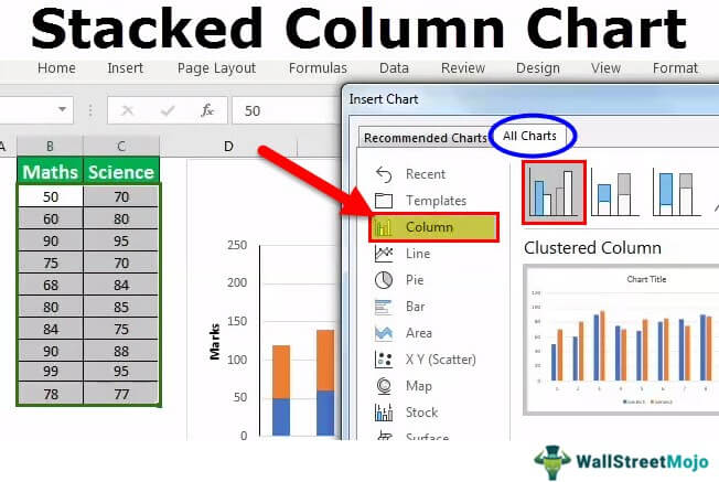
Step 2: Go to the Insert Tab
Next, go to the Insert tab in the Excel ribbon. This is where you'll find the chart tools.
Step 3: Click on the Column Chart Button
In the Charts group, click on the Column chart button. This will open a drop-down menu with different column chart options.
Step 4: Select the Stacked Column Chart Option
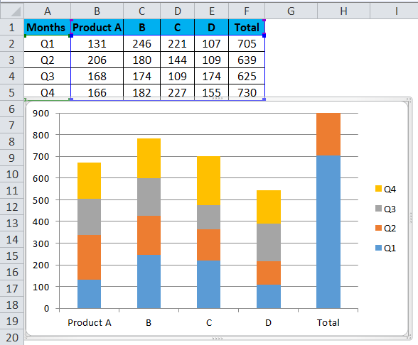
From the drop-down menu, select the Stacked Column chart option. This will create a new chart on your worksheet.
Step 5: Customize Your Chart
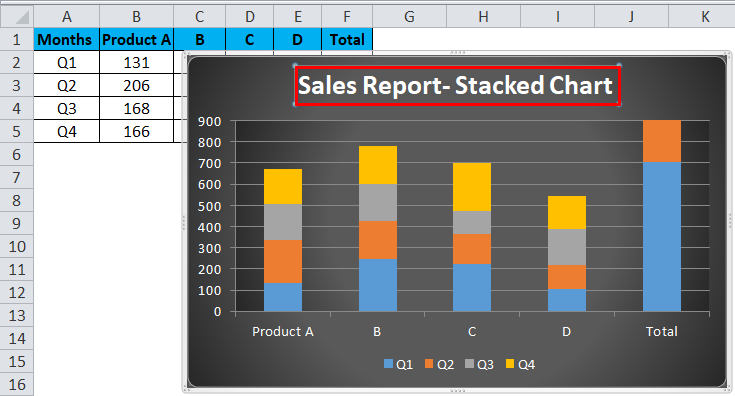
Once you've created your chart, you can customize it to suit your needs. This might include changing the chart title, adding axis labels, and adjusting the colors and formatting.
Tips and Tricks for Creating Stacked Column Charts
Here are a few tips and tricks to keep in mind when creating stacked column charts in Excel:
- Use clear and concise labels: Make sure your category labels and data series labels are clear and concise.
- Use colors effectively: Use colors to differentiate between data series and make your chart more visually appealing.
- Avoid too much data: Stacked column charts can become cluttered if you have too much data. Try to limit yourself to 3-5 data series.
Common Challenges and Solutions
Here are a few common challenges you might encounter when creating stacked column charts in Excel, along with some solutions:
- Challenge: My chart is too cluttered.
- Solution: Try reducing the number of data series or using a different chart type.
- Challenge: My chart is not displaying the data correctly.
- Solution: Check that your data is organized correctly and that you've selected the right chart type.

Variations of Stacked Column Charts
There are several variations of stacked column charts that you can use in Excel, including:
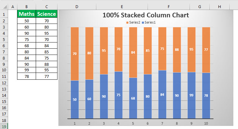
- 100% Stacked Column Chart: This type of chart shows the percentage contribution of each data series to the total.
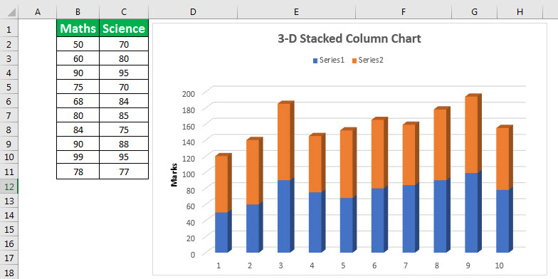
- 3D Stacked Column Chart: This type of chart uses 3D bars to create a more visually appealing chart.
Best Practices for Using Stacked Column Charts
Here are a few best practices to keep in mind when using stacked column charts:
- Use them to compare data series: Stacked column charts are particularly useful when you want to compare multiple data series.
- Use them to show contributions: Stacked column charts are great for showing how different components contribute to a whole.
- Avoid using them for too much data: Stacked column charts can become cluttered if you have too much data.
Conclusion
Stacked column charts are a powerful tool for data analysis in Excel. By following the steps outlined in this article, you can create stacked column charts with ease. Remember to use clear and concise labels, use colors effectively, and avoid too much data. With practice, you'll become proficient in creating stacked column charts that help you communicate complex data insights to others.


What is a stacked column chart?
+A stacked column chart is a type of chart that shows the contribution of different data series to a total. Each data series is represented by a column, and the columns are stacked on top of each other to show the total.
How do I create a stacked column chart in Excel?
+To create a stacked column chart in Excel, select the data you want to use, go to the Insert tab, click on the Column chart button, and select the Stacked Column chart option.
What are some best practices for using stacked column charts?
+Some best practices for using stacked column charts include using them to compare data series, using them to show contributions, and avoiding too much data.
