Understanding and analyzing data is a crucial aspect of making informed decisions in various fields, including business, science, and engineering. One of the key tools in data analysis is the normal probability plot, also known as the quantile-quantile plot or Q-Q plot. This plot helps in determining whether a dataset follows a normal distribution, which is essential for many statistical analyses.
In this article, we will discuss five ways to create a normal probability plot in Excel, a widely used software for data analysis.
What is a Normal Probability Plot?
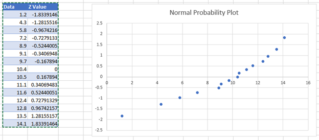
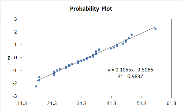
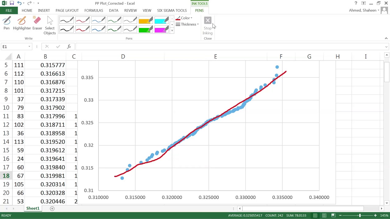
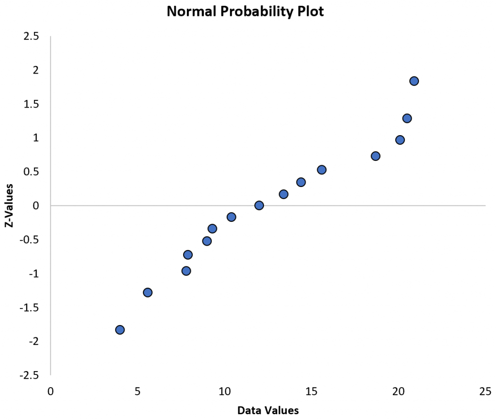
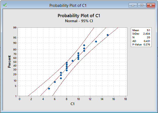
A normal probability plot is a graphical representation used to determine whether a dataset follows a normal distribution. The plot compares the observed data with a normal distribution, allowing you to identify any deviations from normality. The x-axis represents the quantiles of the standard normal distribution, while the y-axis represents the observed data.
Why is Normal Probability Plot Important?
Normal probability plots are essential in statistical analysis for several reasons:
- Determining Normality: The plot helps to determine whether a dataset follows a normal distribution, which is a fundamental assumption in many statistical tests.
- Identifying Outliers: The plot can be used to identify outliers in the data, which may indicate errors in data collection or unusual patterns.
- Comparing Distributions: Normal probability plots can be used to compare the distribution of two or more datasets.

Method 1: Using Excel's Built-in Functions
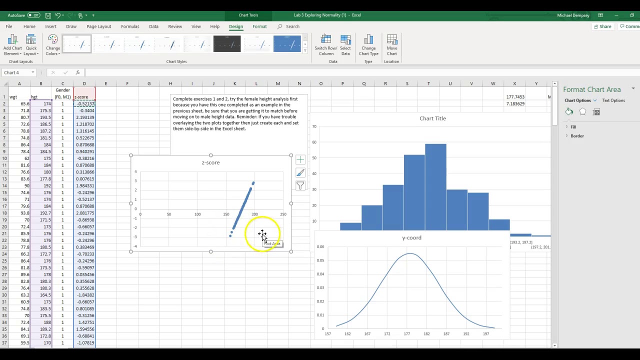
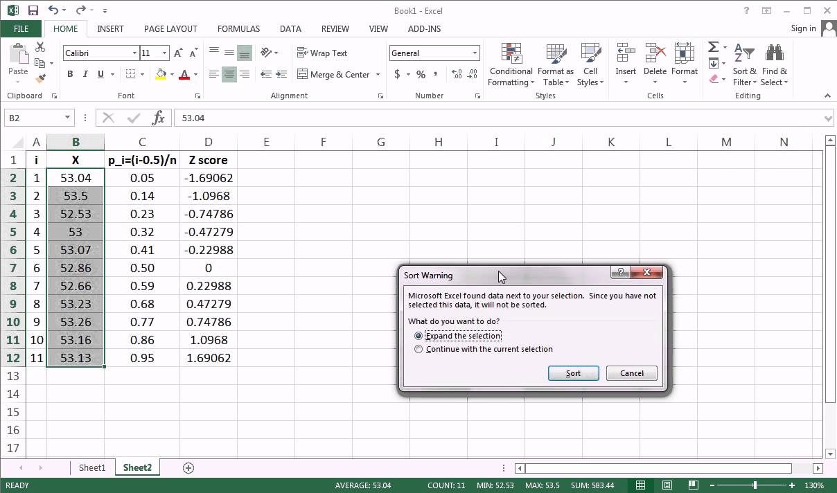
Excel provides built-in functions to create a normal probability plot. Here's a step-by-step guide:
- Enter your data in a column.
- Go to the "Formulas" tab and click on "More Functions" in the "Functions Library" group.
- Select "Statistical" and then click on "NORMSINV" to calculate the inverse of the standard normal distribution.
- Enter the formula
=NORMSINV((ROW(A1)-0.5)/COUNT(A:A))in the cell next to your data, assuming your data is in column A. This formula calculates the quantiles of the standard normal distribution. - Copy the formula down to the rest of the cells.
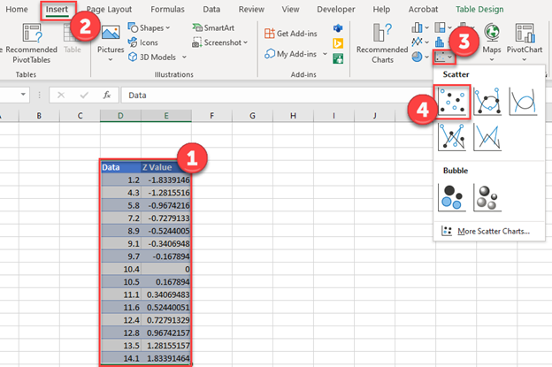
- Plot the calculated quantiles against the observed data using a scatter plot.
Method 2: Using Excel's Power Query
Power Query is a powerful tool in Excel that allows you to manipulate and analyze data. Here's how to create a normal probability plot using Power Query:
- Go to the "Data" tab and click on "From Table/Range" in the "Get & Transform Data" group.
- Select your data range and click on "OK".
- In the Power Query Editor, click on "Add Column" and then select "Custom Column".
- Enter the formula
= Table.Sort(#"Changed Type", {"Column1", Order.Ascending})to sort the data in ascending order. - Click on "OK" and then click on "Close & Load" to load the data back into Excel.
- Plot the sorted data against the quantiles of the standard normal distribution using a scatter plot.
Method 3: Using Excel's VBA Macro
You can also create a normal probability plot using an Excel VBA macro. Here's a sample code:
Sub NormalProbabilityPlot()
    Dim dataRange As Range
    Dim quantileRange As Range
    Dim i As Long

    Set dataRange = Selection
    Set quantileRange = Range("B1:B" & dataRange.Rows.Count)

    For i = 1 To dataRange.Rows.Count
        quantileRange(i, 1).Value = WorksheetFunction.NormSInv((i - 0.5) / dataRange.Rows.Count)
    Next i

    Charts.Add
    ActiveChart.ChartType = xlXYScatter
    ActiveChart.SeriesCollection.NewSeries
    ActiveChart.SeriesCollection(1).XValues = quantileRange
    ActiveChart.SeriesCollection(1).Values = dataRange
End Sub
Method 4: Using Excel's Add-ins
There are several Excel add-ins available that can help you create a normal probability plot. One popular add-in is the "XLSTAT" add-in.
- Install the XLSTAT add-in and activate it in Excel.
- Select your data range and click on "XLSTAT" in the ribbon.
- Click on "Descriptive statistics" and then select "Normal probability plot".
- Follow the prompts to create the plot.
Method 5: Using R or Python with Excel
You can also create a normal probability plot using R or Python with Excel. Here's a sample code in R:
library(ggplot2)

# Load data from Excel
data <- readxl::read_excel("data.xlsx")

# Create normal probability plot
ggplot(data, aes(sample = value)) +
  stat_qq() +
  labs(x = "Theoretical Quantiles", y = "Observed Values")
And here's a sample code in Python:
import pandas as pd
import matplotlib.pyplot as plt
import scipy.stats as stats

# Load data from Excel
data = pd.read_excel("data.xlsx")

# Create normal probability plot
plt.figure(figsize=(8, 6))
stats.probplot(data['value'], dist='norm', plot=plt)
plt.title("Normal Probability Plot")
plt.show()

Gallery of Normal Probability Plots



What is a normal probability plot?
+A normal probability plot is a graphical representation used to determine whether a dataset follows a normal distribution.
Why is normal probability plot important?
+Normal probability plots are essential in statistical analysis to determine normality, identify outliers, and compare distributions.
How do I create a normal probability plot in Excel?
+You can create a normal probability plot in Excel using built-in functions, Power Query, VBA macro, or add-ins.
Creating a normal probability plot in Excel can be done using various methods, including built-in functions, Power Query, VBA macro, add-ins, or R/Python with Excel. The plot helps to determine normality, identify outliers, and compare distributions. By following the steps outlined in this article, you can create a normal probability plot in Excel and enhance your data analysis skills.


